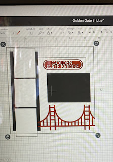
I usually don’t cut the shapes since they represent photos and patterned papers but it’s good to see the whole layout as designed.
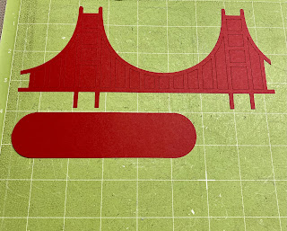
I used Pop Tone Wild Cherry and Whipped Cream for the title and bridge.
CutCardStock Pop Tone paper is 80# and perfect for cutting with the Cricut. And, it's on sale this month!
I added the punched border on the left because I felt it needed a little something over there and that's also why I stamped using white ink & generational stamping around the layout as well. I love that "Oh Yes". I think it's a lot of fun!
Don't look too close at the map patterned paper, it's actually a map of NY. I covered most of it with the photos so I think it still works. That was the only map paper I had in my stash!


No comments:
Post a Comment
Thanks for visiting. I appreciate your comments. I love sharing my projects with you and hope to encourage you to create things on your own. Thanks again!