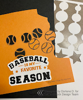
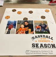
I know I've said this many times, I don't do mixed media layouts...guess what? I did. I designed this layout in Cricut Design Space first. After I cut the elements out, I placed the elements on the white layout base and realized that it was way too stark for a baseball layout.
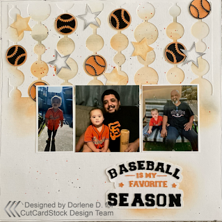
Look at the difference! It needed the grunge!
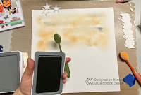
So, I pulled out two shades of orange ink and a gray one. I didn't want to use black since I thought it would be too dark.
Check out the YouTube process video to see exactly what I did:
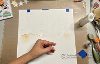
Originally I thought I'd just layer the cut pieces onto the layout and guess their location, but I decided to use the cutaway portion to use as a guide. I taped the cutaway portion down using blue painter tape since it would be easy to remove. I taped it on the top in a hinge fashion. This was a great time saver!
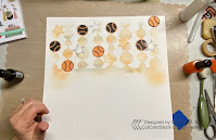
Then I adhered the baseballs, stars and photos to the top half of the layout. I love how this is turning out! When I was ready to place the title, I realized it needed something to rest on too so I added some more orange ink mostly on the right side of where the title would lay.
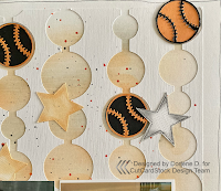
Close Up:Materials Used:
All Cardstock is from CutCardStock and can be found HERE
Pop Tone Orange Fizz, Pop Tone Black Licorice and Wedding Cake Textured cardstock for the base & the fun white layer. (I don't even know what to call that!)
Inks: Only Orange by Stampin Up! Nectarine and Pewter from Close To My Heart (CTMH)
Black Licorice and Citrus Cooler Color Silk (splash) from Fun Stampers Journey/Spellbinders
Cricut Design Space for the title, baseballs, stars and circle cut outs.
Be sure to check out this post on the CutCardStock Blog and leave a comment!



No comments:
Post a Comment
Thanks for visiting. I appreciate your comments. I love sharing my projects with you and hope to encourage you to create things on your own. Thanks again!