Page Two of the layouts for my photos of the Desert Museum. Believe me, I took a ton of photos but only felt the need to print some of them. I have three layouts of this day trip and I love them all!
Click HERE to see the left side of this spread and here's the right side or page two of it. I followed the same base as the first layout but then followed sketch #271 from Sketch n Scrap. I love that you can take two one page layouts and make them flow into a two pager. Do you do that?
It's easy to do when using the same products/colors/themes, etc.
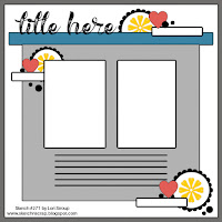
Here's the sketch from Sketch n Scrap
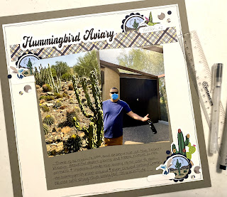
My layout:
I used my Cricut to create Print n Cut embellishments and title for the page, just like I did for the first layout. Although I used different images, it still all coordinates!
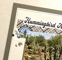
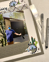
Some close ups:
Be sure to click over to the Sketch n Scrap website and/or the Facebook page for all the sketches and challenges!
Products Used:
Cricut Print n Cut for embellies
Scalloped, label, 3/4" and 1/4" circle punches from SU!
1/2" circle punch from my stash (I think I bought it from Amazon)
Cardstock from CutCardStock; Basis Navy Blue, Wedding Cake White, Cougar Smooth White, Lava Stone Gray
Fine Point Black Pen


How fun! I love hummingbirds! Great job with the sketch Dorlene!
ReplyDelete