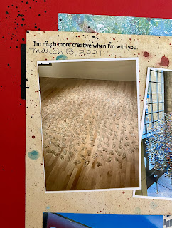
I created this artsy layout to showcase some photos I took when we visited the San Jose Museum of Art. I didn't take many photos - mostly because I was so engrossed at the art and just didn't think to take out my camera. I do love the photo of my daughter and son looking at the wall art. I had to mat that one so it would stand out a little more than the other photos.
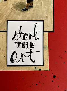
I decided to use some artsy paper for the layout. One was a piece that my daughter had created years ago at a workshop and another was an older gel print that I had done. I stamped the title with a stamp set from Jane Davenport and matted it with black cardstock.
Some black licorice splatter on the diagonal corners to finish it up. Honestly, I wasn't sure how to embellish this one. I have some art/creative type stamps but those were mostly painting type icons and I didn't think it really fit.
I created a process video of how it came together:
I chose the red cardstock base because of the museum sign. This really could have been any color but I like the pop of red!
Is it just me or does everyone have trouble keeping things straight on the layout? Even with the various rulers, nothing ever seems straight!


No comments:
Post a Comment
Thanks for visiting. I appreciate your comments. I love sharing my projects with you and hope to encourage you to create things on your own. Thanks again!